We have prepared for you a big instruction about the website layout. We’ll figure out what it is and how it can help a business owner, a designer, or a layout designer. We’ll study the stages of creating a layout from scratch, compare online layout services, and create a website layout together in Photoshop.
What is a website layout
A website layout is a realistic prototype created in a graphics program like Photoshop. It looks like a ready-made website: with all the blocks of text and images, buttons, wallpaper, and so on. The only difference is that the layout has no functional content: for example, the product page is filled with description templates.
Why do we need a website layout?
Site layout – is the result of the designer’s work on behalf of the customer. Then the layout is transferred to a codifier and programmer, these professionals have converted a graphic file into a real site.
Ideally, the creation of a site layout involves many professionals, except the designer and layout designer: copywriter, user interface designer, backend programmer, and even a marketer.
Layout is needed so that the whole process went quickly: the performers had to make minimum changes, and the customer saved time and money.
Layout helps in this whole process:
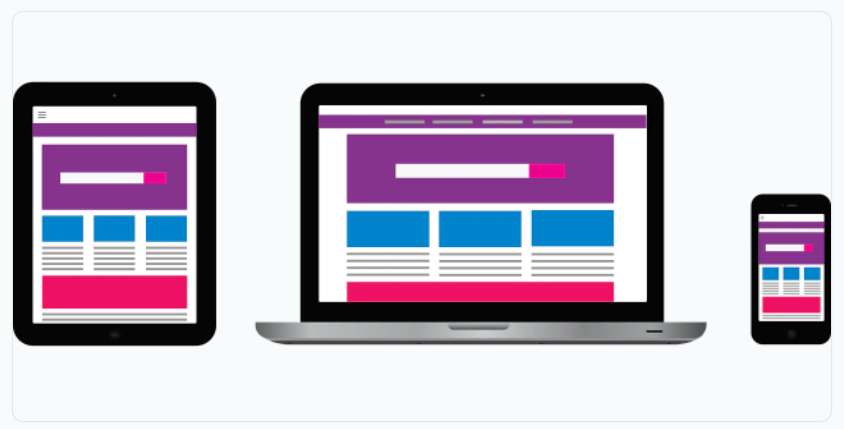
- See in advance how the customer’s wishes will look like in practice, including the mobile version of the site and animation elements.
- To develop a unified design for all pages of the site and all of its typical elements.
- Thinking over the content elements – text and images.
- Coordinate the entire project team, set a clear framework for the work.
Layout development site: we work step by step.
Let’s understand in detail how a layout comes into being and what to take into account during the creation process.
The terms of reference
Always start “on the shore”, with the drawing up of the terms of reference. Even if you make your own layout, the task will come in handy: when you caught the designer’s courage and have been playing with fonts for three hours, the task will get you back on track. What should be in it:
- The goals of the site – what it will specifically do for your business.
- A brief analysis of the target audience – who you’re making the site for, what those people’s needs are.
- User scenarios – how your visitors will use the site, how you plan to bring them to the action you want.
- The number and approximate content pages of the site. Just in case, do not forget to draw and page 404.
- Deadline – it is worth prescribing, if you involve outside experts.
Prototype
When the job is prescribed, you can make a block structure of the site layout, that is, a prototype. This is a schematic drawing, which shows the location of the main elements: the header, footer, content blocks on the page, the approximate ratio of their sizes.
Color matching
Select no more than five colors – a couple for the font, a couple of base colors for the background and one accent color. If you have a logo or brand book, refer to it.
Those who find it difficult to choose colors can use a special service. There are a lot of them, here are some free ones:
- Adobe Color
- ColorCode
- ColrD
- Cohensive Colors
- ColorHunter
Font selection
For the layout of the site you also need a couple of fonts – one for titles, the other for the main text. At most, you can pick up a third if you really need to. What you need to keep in mind when choosing a font:
- Copyright. You either have to buy the font or find one you can use for free. Look for free fonts on Google Fonts, Font Space, 1001 free fonts.
- The right characters and fonts. Sometimes a font doesn’t have italics or bold, or special characters like currencies or the letter “e” are missing. Of course, you can style the font with the built-in tools of Photoshop and add signs from the other, but this violates the integrity of the font and the overall look of the page, and add prosthetics.
Working out
Now you can start directly creating the layout of the site.
- Create a grid of guides, which will adjust the objects on the page.
- Partition the page according to the prototype – determine the place for the header, footer, main content blocks.
- Create some basic elements – an example button, description, header and others you need, and put them outside the workspace. Be able to copy and paste them where you want them.
- Start working out each area in detail.
- Don’t forget to draw interactive elements in different states. For example, if a button changes state when you click it or a font increases when you hover it, create separate layers for both states.
- In one of the next sections, I’ll show you step by step how to create a website layout in Photoshop according to this scheme.
Important! Draw each element on a separate layer and name it logically. Button – button, product name – item name and so on. Don’t forget to group layers logically and give groups names.
Creating a guide
It is a good idea to make a description of the layout of the site for the codifier. In the description you can fix all the main characteristics of the layout:
- colors chosen,
- the size of the grid,
- descriptions of basic elements and so on.
Also add to the description of the elements that may cause doubt in the codifier, such as screenshots of the states of interactive elements with a description of the animation. Describe the typography used: fonts, their colors and sizes, line spacing.
How to create a website layout in Photoshop
I will quickly show you how to create a site layout in Photoshop. We will make the main page of the online store of mugs, it will have a header, blocks with categories of products and footer – everything is simple. The images for the site I will take from the free photobank Unsplash, and you can find somewhere else – for example, in one of the free photobanks in our selection.
Look at what devices people are more likely to come to your site from – phones, tablets or computers. The first thing you need to do is make a version for the most popular version and work out the rest from that.
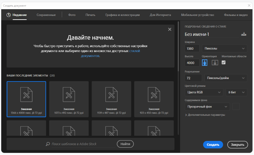
Create a new file in Photoshop. You can customize it yourself or go to the “For the Web” tab. By default, the program offers a “Custom” layout with a size of 1366 by 4000 pixels, I’ll round up the width a bit to 1380 pixels. This is a common size, fitting the size of your computer or laptop screen. The color model is RGB, the resolution is 72 pixels per inch, and the background is transparent.
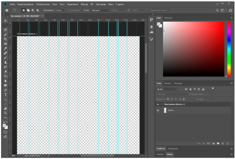
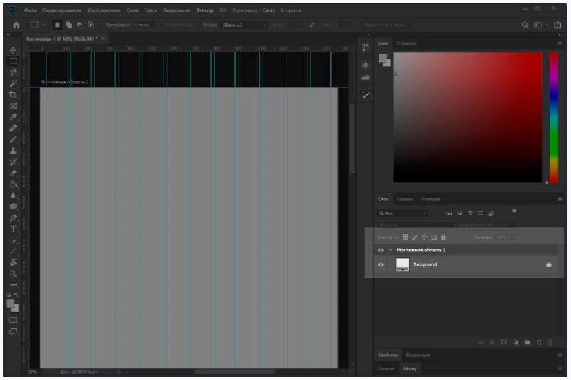
Now we set the modular grid. Go to the “View” tab of the top menu and choose “New Guide Layout” there. By default, the program offers to create eight columns with margins and internal indents, but we will make 12 – so it will be more convenient to divide the page into 2, 3, 4 or 6 blocks.
Also set the middle value of 15 pixels (this is the internal gap between columns), the top and bottom field will be set to zero, right and left – 30 pixels. You can choose your own values, but remember that the indents and margins must be a multiple of one digit, such as 5.
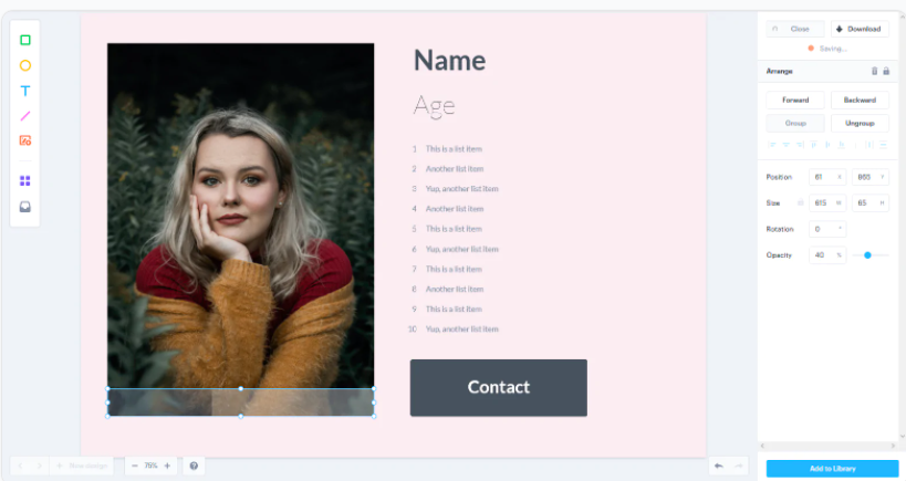
Now let’s fill in the background. To do this, use the adjustment layer – it will be easier to change its color if necessary, so you don’t have to fill it all over again. In the “Layers” panel, we choose the circle icon, click on it and choose the “Color” option and specify the desired shade. Now all that’s left is to remove the mask from this layer so that only the color remains.
Don’t forget to rename the layer, preferably in Latin characters, and you can lock it immediately with the lock icon button in the Layers panel.
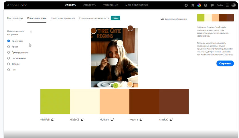
The next step is to choose the colors. I have already chosen the background image, so we will use the Adobe Color service as a starting point. Go into the service, choose “Extract Theme” in the menu, load the picture and get a few ready combinations. The resulting color codes can be copied.
Done, you can start rendering directly. I’m going to have a small and simple landing page, so I’m not going to work through the block structure, but I’m going to start creating elements right away. If you’re doing something more complicated, it’s better to sketch a schematic first.
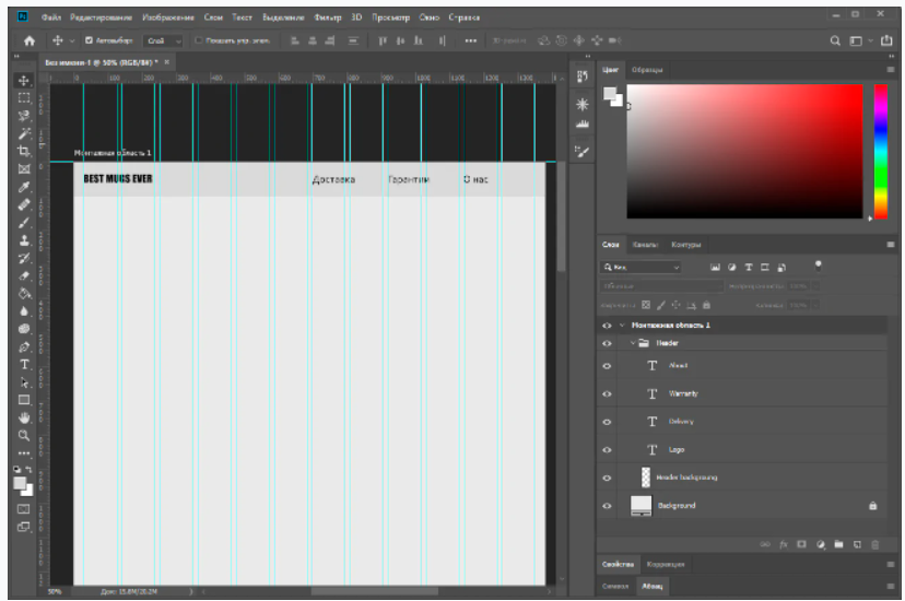
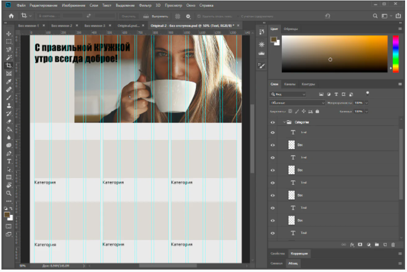
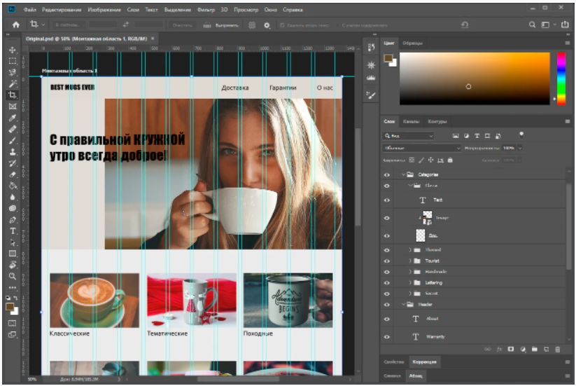
The first thing we’ll do is create a header with the company logo and links to other sections of the site. The basis will be a rectangle filled with one of the selected colors. I do not have a logo, so I’ll just write an invented name in the header and create headers for other sections of the site.
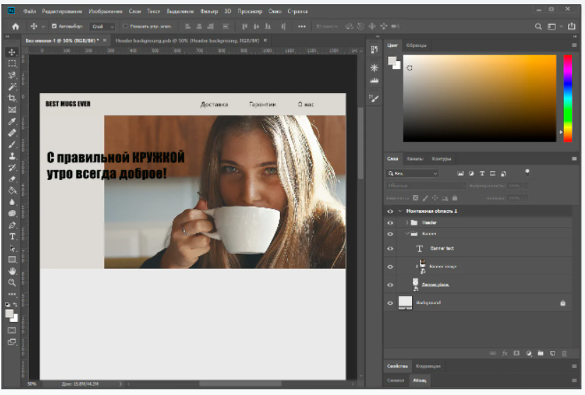
Now I will add the main image of the page and write a little slogan on it. Container for the banner, the banner and the text on it grouped in a folder Banner. If you will be placing an image as in my example, leaving no field on one side – be sure to make a mark for the codifier, as the picture should behave when stretching the page width. For example, that it should remain “glued” and the right side will be an empty field, or it should increase with the page.
It’s time to make category blocks, and I’m going to have six of them. In order not to make them too small, I will place them in two rows of three blocks. Given that the layout has 12 columns, one block will take up exactly four columns. I will not work out each block at once, but I will create a template with a gray bar and multiply it into the necessary positions:
Fill the blocks with their pictures and change the text. In parallel, we group the elements so that the picture box, the picture itself, and the caption are in the same subgroup.
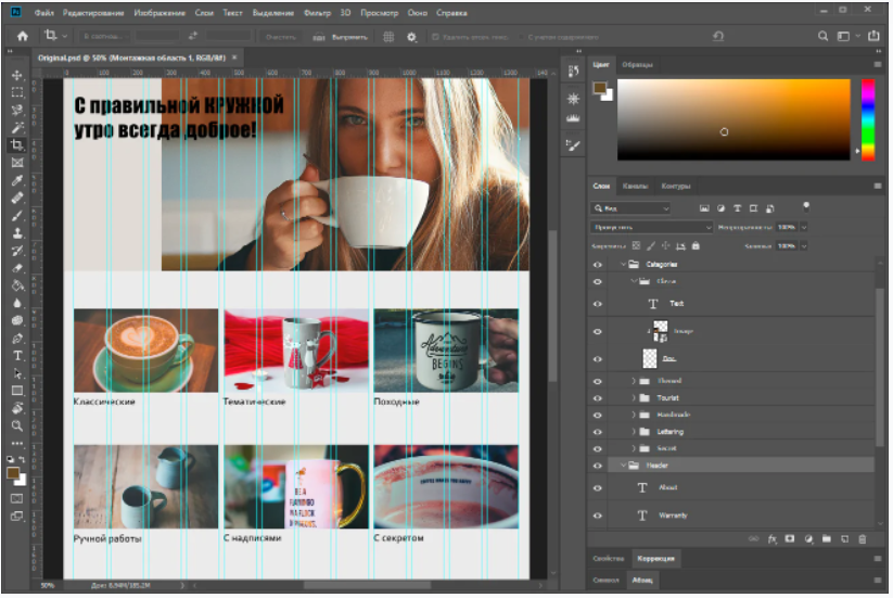
At this point, I don’t really like the margins between the blocks – they’re quite narrow, and the photos blend together. To fix this, I will reduce each block by 10 pixels on the left and right. Note that the header elements have also moved to fit the categories: the logo 10 pixels to the right, the “About Us” element 10 pixels to the left.
The only thing left is the footer. Let’s put a form here to collect mail and contact information. To avoid the usual colored background, I found another picture and put it in the footer. And note that the footer elements are also indented 10 pixels from the guide, as are the categories above them. Don’t forget – be sure to group the layers and give them normal names, so that it’s easier for the layout designer to figure it out later.
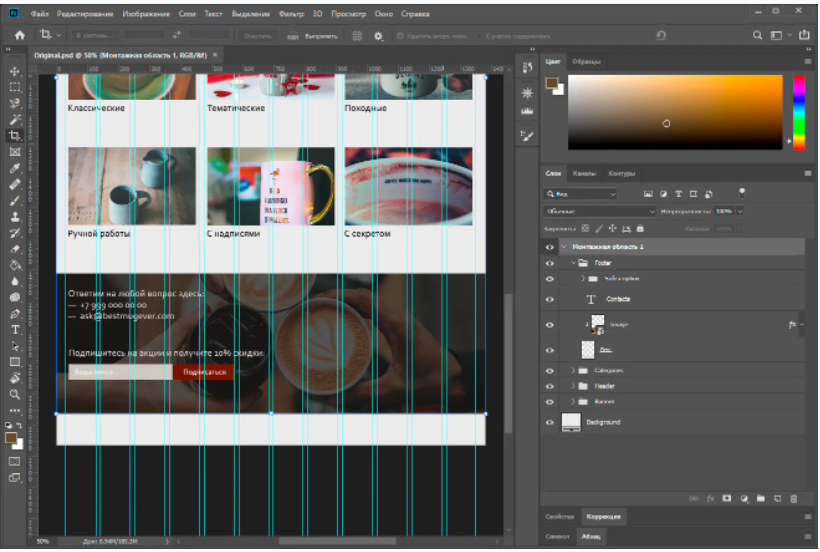
The remaining height of the canvas can be trimmed and enjoy the result. I’m sure your website layout will come out much cooler :).
How to create a website layout online or in a program
Picked for you five services where you can create a layout of the site online, and one convenient free desktop program.
Wilda
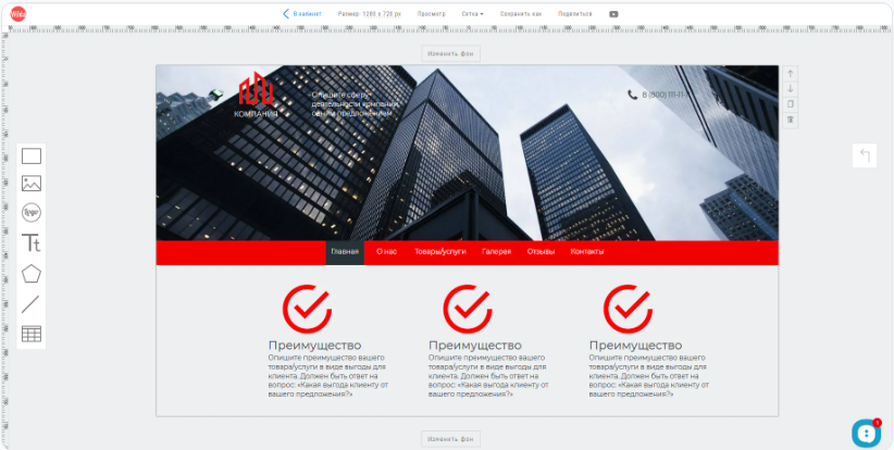
Russian-language online designer, where you can create a layout of the site, document, brochure, banner, and so on. The user chooses one of the templates (for sites there are 16) or works from scratch.
The service has a very simple editor: layouts are built from just six types of elements. There is a picture, a background block, a free-form figure, a logo, text and a line. The editor is connected to a photobank with free images, so you can upload pictures directly when creating a layout.
Price: layouts are created free of charge. You should pay from 150 rubles for one download, or 50 rubles for publishing online. When buying a package plan will be cheaper.
Mockflow
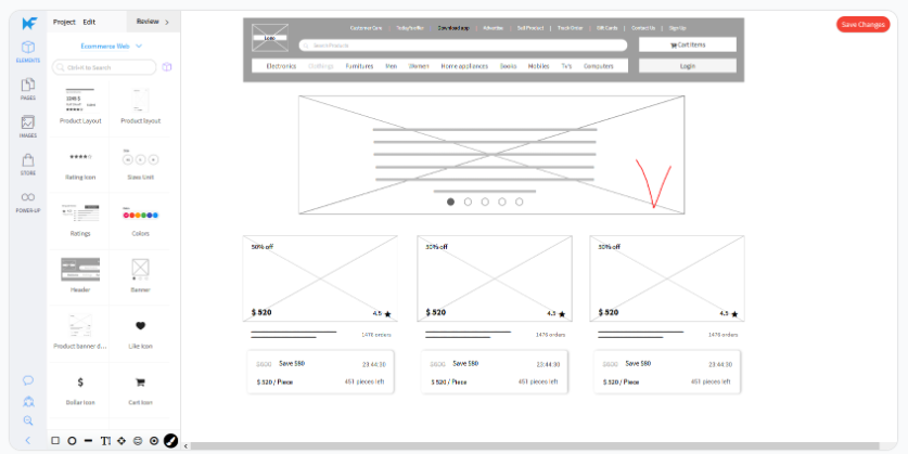
A tool for rapid prototyping sites, designed for UI/UX design. The site layout is composed of ready-made blocks, such as header, product card, banner or “These products were recently searched…” block. These blocks can only be resized, their color or content cannot be edited. Before creating the layout, you need to choose which interface you are going to prototype, this will affect the set of blocks.
Price: There is a free rate for one project of no more than three pages. Then from $15 per month.
iPlotz
A handy, though slightly outdated, online site layout builder. Works on Flash Player, so it can lag, especially on weak computers.
The sense is similar to the Mockflow – there is a set of ready-made elements of the site, which should be dragged over to the work panel, changing only their size. Almost all elements are made in grayscale, color is very little.
There are also two sets of icons, bitmapped and vector, and a set of cursors in the form of “pointing fingers” – apparently, it is designed to create cues coder and programmer, how to click or move a certain element.
Price: free for one five-page project, then from $ 15 per month.
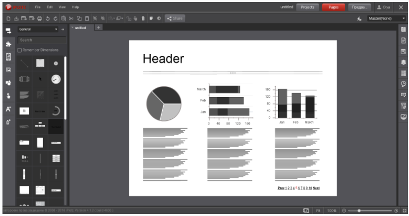
Moqups
In this online layout builder you can make a website, diagram or chart, prepare a business report.
There are 24 website layout templates and the ability to create a layout from scratch. The user is offered to assemble his site from ready-made blocks: text, button, link, radio switch, text entry field, page scrolling, banner and so on. All elements can be customized: change color, size and text on them. If you create a project of several pages, you can link them together to make the site more realistic.
Price: one project with a maximum of 200 elements is available free of charge, then from $16 a month.
Marvel
Another service for creating a website layout online. A nice modern interface, a few tools, but enough to work. There are already ready elements of the site with the ability to edit, shapes – rectangle, ellipse, line, and images with built-in photobank.
And Marvel will also help you simulate a working site even before the layout. How it works: you upload ready-made page layouts to the service and set up their links – for example, select the button area on one page and select another page to go to when you click on that button. As a result you get a simulation of the site or application, where you can “tap” and evaluate the convenience and logic of communication pages.
Price: free for one project without the ability to download the created files. After that, from $12 per month.
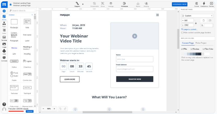
Justinmind
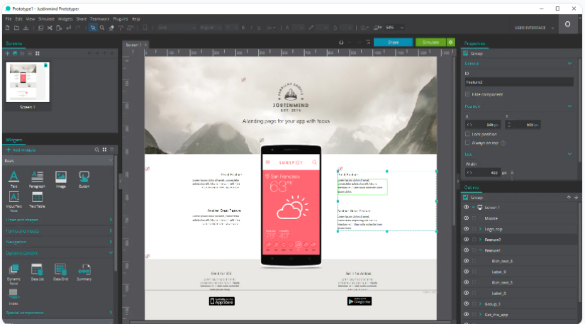
A desktop program with extensive features. In the beginning, the user chooses which interface the design will be created for: mobile on Android or iPhone, desktop or tablet. Then the user mixes the page with ready-made components, which can be flexibly customized: change the color, size, text and pictures.
The program compares favorably with similar online services the number of features, even in the free version. You can see a simulation of how the page will look on your device, and export the result in HTML format. The interface is reminiscent of Photoshop – it will be easy for designers to understand. The program accepts files from Photoshop, Sketch and Adobe XD for input.
Price: unlimited free version. The paid ones start at $19 per month and feature teamwork, expanded feature sets, enhanced support, and other bonuses.
Price: there is a free rate for one project of no more than three pages. Then from $15 per month.
Mistakes in the creation of site layout
The most common mistakes in the layout can be divided into two groups – mistakes that affect the perception and the overall “beauty” of the site, and errors due to which the codifier creates the site incorrectly for the ready-made layout.
Errors in design.
When the site economize, they hire a cheap designer or even entrust the case to a non-professional. Then there are the typical mistakes in design that spoil the look of the layout of the site.
Avoid these mistakes:
- Unbalanced color scheme or mismatched fonts.
- The excess of elements – too many blocks, buttons, labels. The visitor is lost on the page and will not perform the desired action.
- Absence of a mobile version of the site.
Errors critical to the layout.
Sometimes the layout of the site is all good, but with the layout of the flaws come out. This happens because there are some unnoticeable mistakes which the codifier doesn’t understand and carries over “as is”. That’s what you should avoid to make a layout perfect:
- Clutter in layers. You need to remove unnecessary layers – hidden, empty. Normalize naming all the remaining ones and grouping them logically. Ideally you should do this at the design stage of the layout of the site, not when handing over, otherwise you will get confused.
- Effects of transparency and overlay. To make a color lighter, just use a different color, but in no case transparency. Don’t apply blend effects – they display unpredictably in different browsers.
- Elements will wander back and forth by a couple of pixels. Align everything strictly to the grid, otherwise the layout designer can simply cut the object, which protrudes beyond the guideline.
- Confusion with indents. Check the indents – they should be expressed in whole even numbers to make it easier for the caster to move them.
- Incomplete files. Attach fonts and all images to the layout – separate archive for fonts, separate for images. If the fonts are on Google Fonts, you can provide links to them.
Creating a layout of the site: what is worth remembering
Layout – a complete model of the future site. It is needed to coordinate the work of the designer, layout designer and programmer, as well as to clearly show the customer the course of the work.
Creating a layout is as follows:
- Terms of Reference
- Drawing a block scheme – a prototype
- Color matching
- Font selection
- Drawing a layout
- A guide on the layout for the codifier
What mistakes should be avoided to make the site layout look good and it was easy to cobble together:
- Mismatched colors or fonts.
- The excess of colors, fonts, elements.
- The lack of a mobile version of the site.
- Confusion in the layers – in the names, grouping.
- Presence of transparency and overlay effects.
- Non-compliance with the modular grid.
- Random indent sizes, especially fractional.
- Images and fonts are not attached to the layout in separate files.
To make a layout, you can hire a designer or spend time on your own – there are many free services and programs, just find the right one for you. And when the site is ready, be sure to connect to SendPulse – with us it is easy to collect leads and do the mailing via email, SMS, push, Viber and chat-bots.